Reltrad in the U.S., 1972-2018
Religious affliation has changed significantly in the United States since 1972. In this example, I plot the change in religious affiliation over time using data from the 1972–2018 General Social Survey.
I have code on Github that recodes the GSS into the standard RELTRAD categories that are frequently used by sociologist of religion. This code shows how to use ggplot to create a plot of the trends over time. @steenslandMeasureAmericanReligion2000.
#Create a Figure for GSS attendance over time
#Plot the proportions over time
source("https://github.com/thebigbird/R-eltrad2/blob/master/ReltradGSS.R")
#See my github for the code to make these data

#Cut by generation
gss = gss %>%
  mutate(year = as.numeric(as.character(year))) %>%
  mutate(birthyr = year - age) %>%
  mutate(age_cat = cut(birthyr, c(0,1928,1945,1965,1981,1997,2020)))

levels(gss$age_cat) = c("Great","Silent","Boomer","GenX","Millenial","GenZ")

library(srvyr)
#Calculate weighted proportions
#Create survey object using svyr
gss_svy <- gss %>% as_survey_design(1, weight = wtssall,
                                    variables = c(year, reltrad, age_cat))

#Now calculate proportions
out = gss_svy %>%
  group_by(year, reltrad) %>%
  summarize(prop = survey_mean(na.rm=T, proportion = T)) %>%
  drop_na()

#A nice set o' colors
scFill = scale_color_manual(values =
                              c("#1B9E77",
                                "#DDC849",
                                "#7570b3",
                                "#a6761d",
                                "#e7298a",
                                "#1f78b4",
                                "#a9a9a9",
                                "#cc99ff"))

plotout = ggplot(data = out,
                 aes(x=year,
                     y=prop,
                     color = reltrad,
                     group = reltrad)) +
  geom_ribbon(aes(ymin = prop - 1.96*prop_se,
                  ymax = prop + 1.96*prop_se),
                  color = "white",
                  alpha = .2, fill = "grey") +
  geom_point() +
  geom_line() +
  ylab("Proportion of US Population Identifying As...") +
  xlab("") +
  labs(title = "Religious Affiliation in the United States",
       subtitle = "General Social Survey",
       color = "Religious Tradition",
      caption = "http://www.davideagle.org; Data: https://gss.norc.org") +
  theme_minimal() + scFill +
  theme(axis.text.x = element_text(angle = 70, hjust = 1)) +
  ggtitle("Religious Affiliation in the United States 1972-2018")

plotout
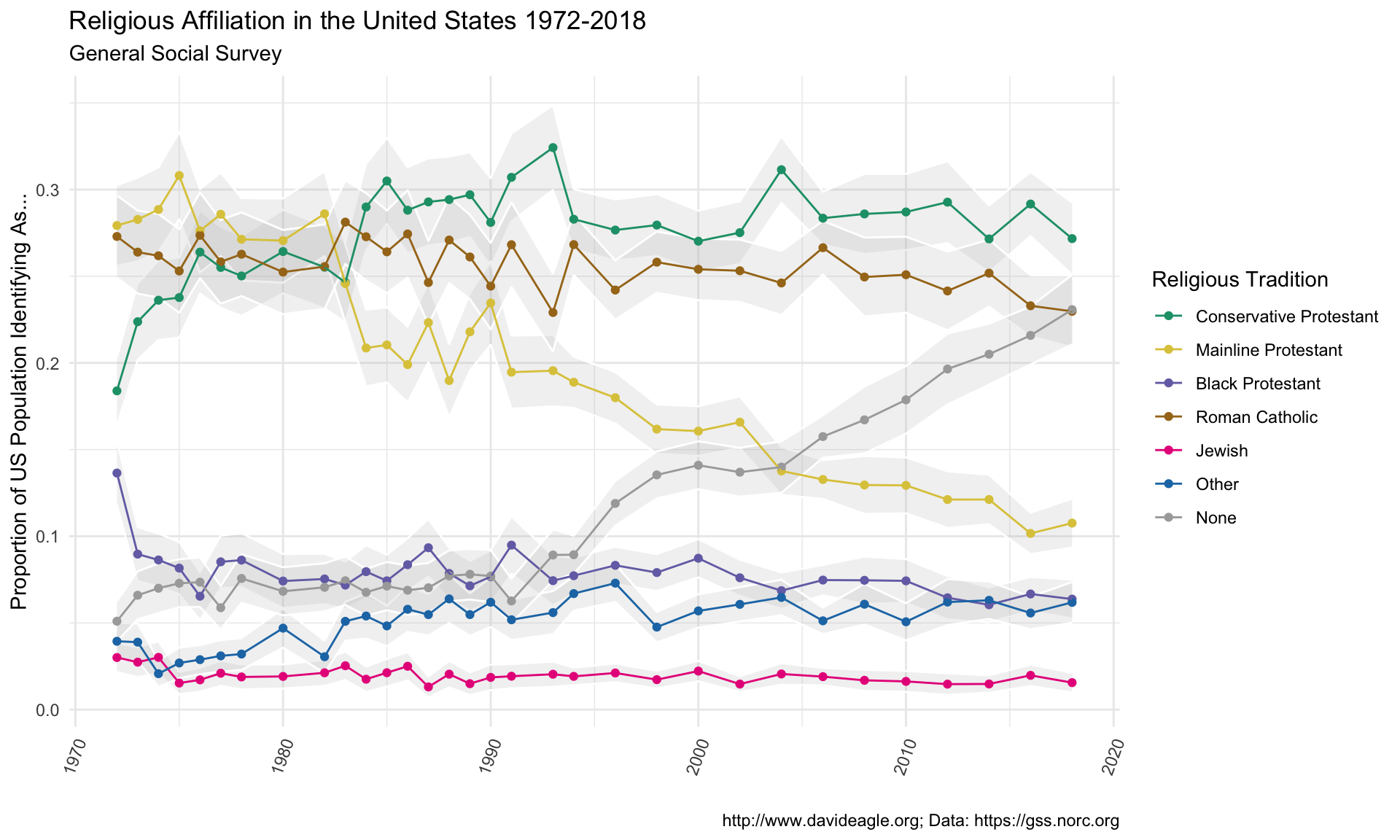
A few notable trends are evident in this plot. First of all, the proportion of Roman Catholics in the United States has stayed relatively steady over this period. While Latin American immigration has brought a lot of new Catholics to the United States, this has been offset by losses among the non-hispanic Catholic population.
Second, there has been a very steep rise in the number of people claiming no religious affiliation. Non-affiliates were a pretty steady 5-8% of the US population from the early 1970s to the early 1990s. The proportion of nones has climbed steeply since then, reaching a high of 25% of the US population, making them the second largest “religious” group in the United States. They could very well surpass Catholics by the time the next wave of GSS data are released.
The higher proportion Black Protestant in 1972 is probably due to some sort of artifact in the GSS data. There seems to be a lower proportion of Conservative Protestants that year as well. This blip is also found on other plots of GSS reltrad data, here, for example.
Third, Mainline Protestants are in free fall. They are now about 12% of the US population, down about 20 points from their peak in the early 1970s. Conservative Protestants made some gains in the mid-1980s to mid-1990s (probably due to people leaving mainline denominations over cultural issues), but are also declining. They are down about 10 points from their high in the early 1990s.
Also important is that the “Other” religion category is steadily climbing, and has reached a high of about 5% of the US population. The proportion of the population identifying as Black Protestants remained fairly steady over this period, but recently has begun to decline. This is likely due to more Black Protestants identifying with Conservative Protestant denominations rather that historically Black denominations.
David E. Eagle, Ph.D.
Assistant Research Professor of Global Health and Sociology
My research interests include the sociology of religion, theological education, and racial inequality.